Logo and visual identity for "Metroborgo" Montalto delle Marche.
Roles
Logo Design Brand Identity
The conceptual work for the creation of the visual identity of the “Montalto delle Marche Metroborgo” is based on the intrinsic ambivalence of the project: the desire to protect the historical and cultural heritage of the Borgo conveying a vital and dynamic image typical of the great urban centers.
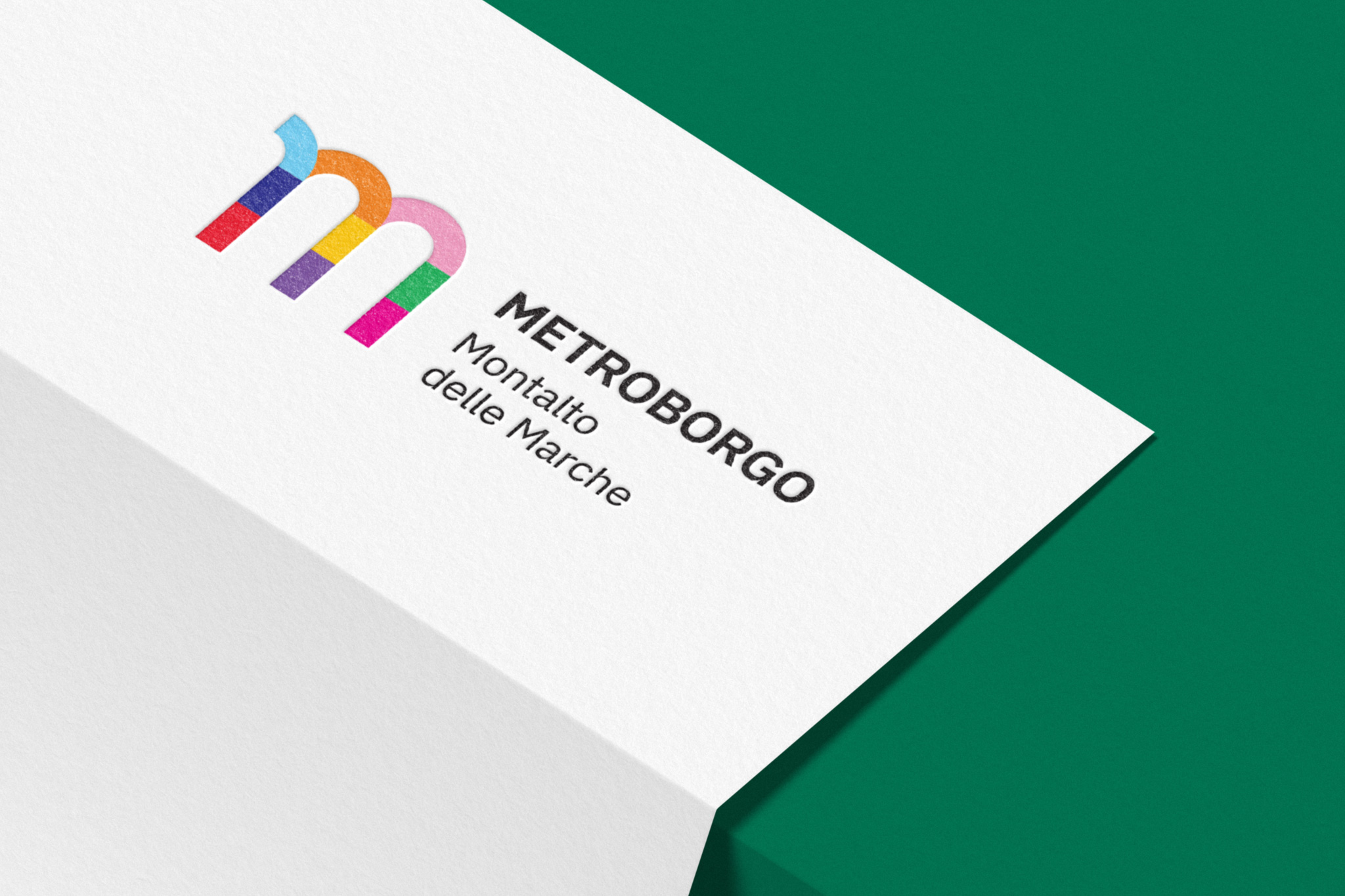
The institutional logo is formed by the typographical element "m", the initial letter of some key words of the project: METROBORGO, MONTALTO and MARCHE.
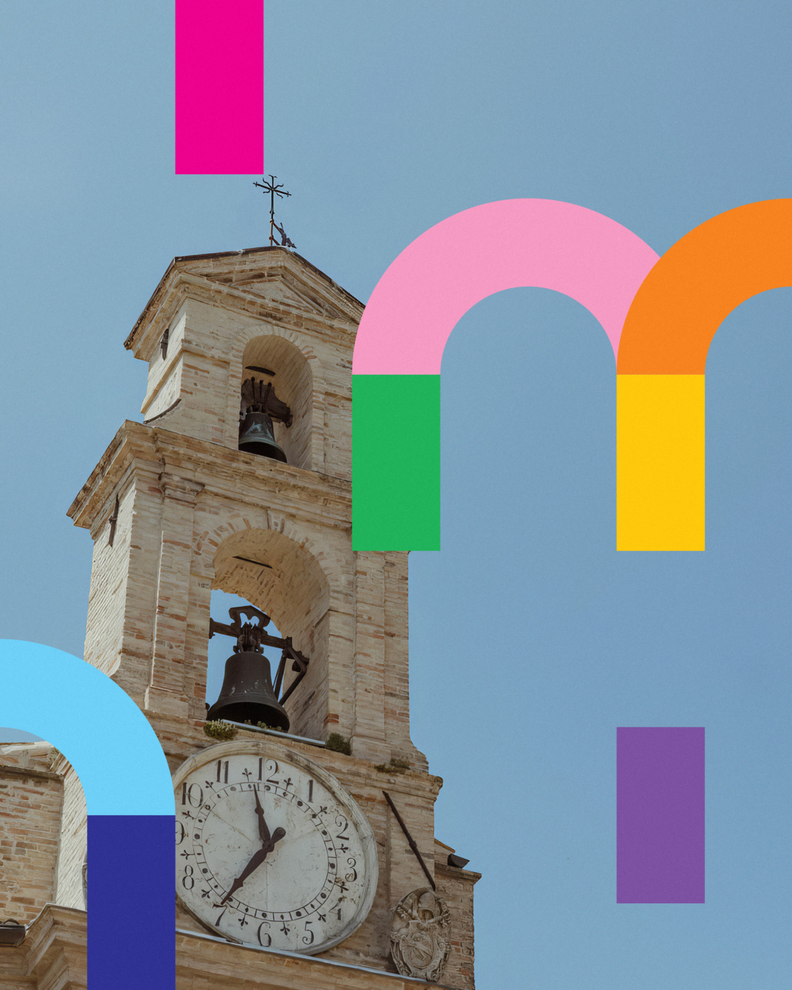
The "m" becomes a track, a subway line of the Metroborgo where 9 segments that differ in color can slide. The chromatic element is a fundamental part of the new visual grammar, each color corresponds to a place and its activities.
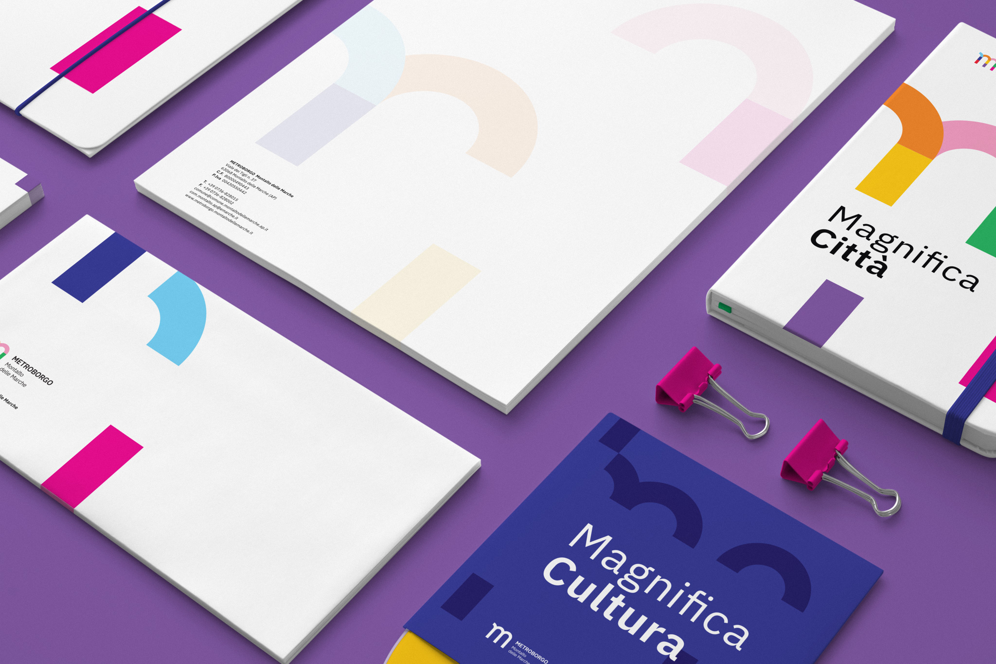
The modularity of the elements that make up the logo are strategically recovered in the different communicative declinations, creating a dynamic narrative, new and coherent at the same time.
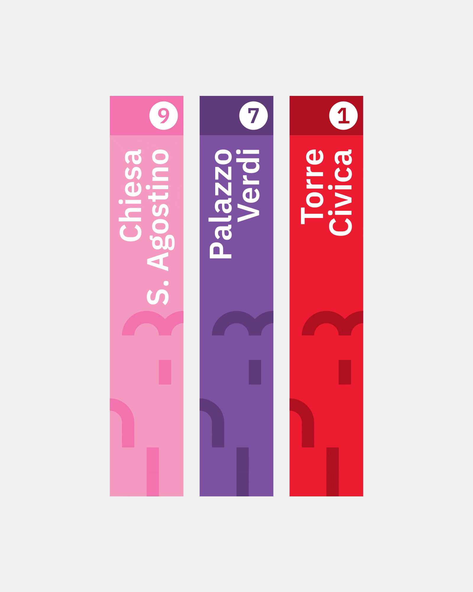
The signage of the Metroborgo project sites was designed with the aim of offering a legible and immediately consultable information service. Through the chromatic selection, it becomes part of the street furniture, giving the Borgo a modern and dynamic flavour. The graphic layout of the signs reminds the urban subways, with their bright colors and large typographical elements.
We imagined an intuitive app to allow visitors (and non-visitors) of the Metroborgo to discover the various points of interest. From the main screen you can access the project site sheets, shown as if they were tickets from your digital wallet. In each tab you can consult all the information about the place, discover the events and, where possible, purchase any tickets. At the bottom, an always visible navigation bar allows you to view the menu and consult the map of the Metroborgo.